
Oh I was too busy staring at the potential deletion of characters to remember to thank you guys a lot. Big improvement.
Announcing ....
- Eldon
- Exile
- Post #2
Announcing ....
Thanks. It was a lot of work, but I do wish it were nicer looking. That said, though, I'm hoping (crossing my fingers here) that it's reliable. I've put logging in at multiple places to show me what's going on in the event that something fails. But, I'm hoping it doesn't get to that. There are still things for me to do on the back-end to make things easier for Joe to do renewals. As I've mentioned before, the automatic re-billing isn't, uhm, automatic. But, if you select that button, Joe can pull reports to bill credit cards. My next step is to do that last part for him. Of course, you can always just add the time yourself. I've been thinking about creating a report that automatically sends mail to folks telling them that their account is about to expire. The problem with that is that most folks haven't corrected their email address(es) in years.Fundin wrote:Nice work guys, we use that e-commerce module at work so I know the amount of work involved, good job.
So, please update your email address!
- Skirwan
- Exile
- Post #3
Announcing ....
Looks very nice. Congrats on finishing the project, Eldon.
- Eldon
- Exile
- Post #5
Announcing ....
Thanks to all of the Beta Testers!Mac wrote:What?!?! No thanks to us beta testers? *sniff*
- Fogtripper
- Exile
- Post #6
Announcing ....
Dropshadow for a white background. Easily changed if (when) the banner color is changed.

I'd suggest lining up content more neatly, limit text styles, remove underlines from non-links, and make links more consistant. The current design is clumsy and all over the place. (my clients are up front with me, and I am passing on that bluntness to you...for free!)
I'd suggest lining up content more neatly, limit text styles, remove underlines from non-links, and make links more consistant. The current design is clumsy and all over the place. (my clients are up front with me, and I am passing on that bluntness to you...for free!)
- Phroon
- Exile
- Post #7
Announcing ....
Um... how exactly is the outside world going to find this?
All I can seem to find are these: http://deltatao.com/clanlord/order.html, http://www.deltatao.com/paypal.html
And they don't agree on prices. One is linked from the CL page, the other from the DT main page.
All I can seem to find are these: http://deltatao.com/clanlord/order.html, http://www.deltatao.com/paypal.html
And they don't agree on prices. One is linked from the CL page, the other from the DT main page.
- Eldon
- Exile
- Post #9
Announcing ....
Joe's modifying the other pages. I figured I'd tell the current customers now, let all of you work on it and tell me of any bugs, then when Joe finally changes the other pages, it'll be perfect!Phroon wrote:Um... how exactly is the outside world going to find this?
All I can seem to find are these: http://deltatao.com/clanlord/order.html, http://www.deltatao.com/paypal.html
And they don't agree on prices. One is linked from the CL page, the other from the DT main page.
- Eldon
- Exile
- Post #10
Announcing ....
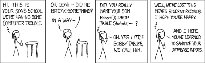
I like that comic. Go ahead and try it. All inputs are smart-quoted.Phroon wrote:
- Skirwan
- Exile
- Post #12
Announcing ....
So you're giving us permission to search for vulnerabilities?Eldon wrote:Go ahead and try it. All inputs are smart-quoted.
- Largo
- Exile
- Post #13
Announcing ....
Okay, it all looks pretty good then. but dontdeletemyguysplzthx
- Eldon
- Exile
- Post #14
Announcing ....
Would you not do it if I told you not to?Skirwan wrote:So you're giving us permission to search for vulnerabilities?Eldon wrote:Go ahead and try it. All inputs are smart-quoted.
I would ask, though, that you tell me privately first if you find any.
- Eldon
- Exile
- Post #15
Announcing ....
I've no idea what half of what you said means.Fogtripper wrote:Dropshadow for a white background. Easily changed if (when) the banner color is changed.
I'd suggest lining up content more neatly, limit text styles, remove underlines from non-links, and make links more consistant. The current design is clumsy and all over the place. (my clients are up front with me, and I am passing on that bluntness to you...for free!)
This is the basic OsCommerce website that many companies use. Except for the first page's HTML, all of the clumsy interface is directly from them. If you have some HTML code suggestions, I'll gladly take them. Seriously. I suck at HTML. Note, though, that Joe wants a very simple first page. I've tried to that. You'll have to do that too.
I chose OsCommerce because it's been vetted many times over. That's not to say it's perfect, but it's open source and has been reviewed many times by people from the world-over. I've been impressed with their degree of PHP and database security, but, you know, it's still PHP and MySQL.
P.S. - I like your logo! Check out the new one that I just uploaded. I hope the artist gives me permission to use his name.